When you’re building a brand, colour is one of the most powerful tools you have.
And in the world of colour, Pantone is the gold standard. For decades, Pantone has helped designers, creators and brands speak the same visual language, and its influence is stronger than ever.
If you’re wondering how to use Pantone colours to elevate your own business, here’s everything you need to know.
Why Pantone colours matter for small business owners
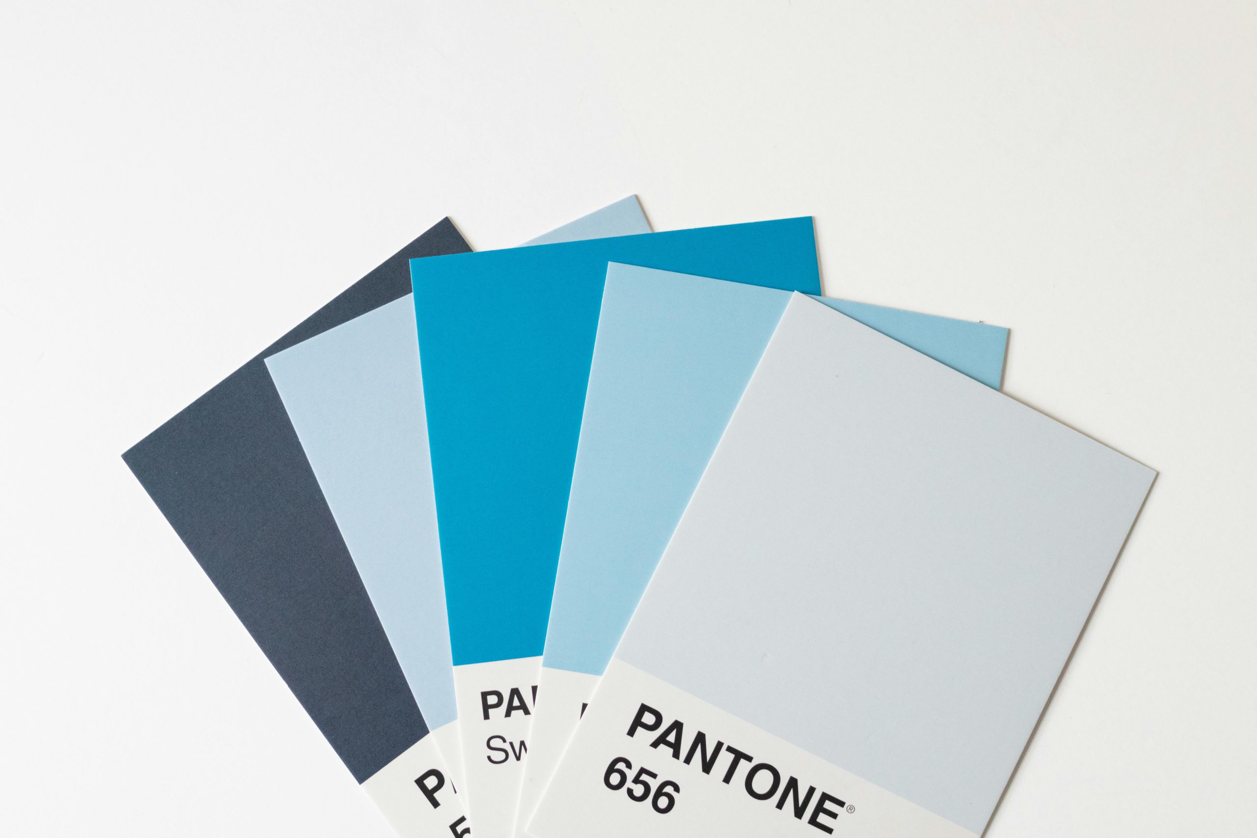
Pantone colours take the guesswork out of design. Whether you’re printing business cards, designing a product label, or creating a logo, Pantone ensures colour consistency across every medium. That means what you see on the screen is what you’ll get in print, no surprises, no mismatched branding, no costly reprints.
For Aussie small businesses, especially those juggling graphic designers, printers and digital creators, Pantone provides a universal reference point. It makes the entire design process smoother, clearer and more professional.
How to use Pantone colours in your small business
Wondering how to use Pantone colours effectively? Start by selecting a Pantone palette for your brand identity – typically one primary colour, one secondary colour, and a few complementary shades. Share these Pantone codes with every designer, printer or creator you work with to ensure consistent results.
You can also use Pantone colours when developing seasonal campaigns, updating your product range, or creating social media graphics. Many design tools (like Adobe Illustrator, Photoshop and Canva Pro) allow you to search and apply Pantone shades directly, making it easy to keep your brand looking sharp and cohesive.
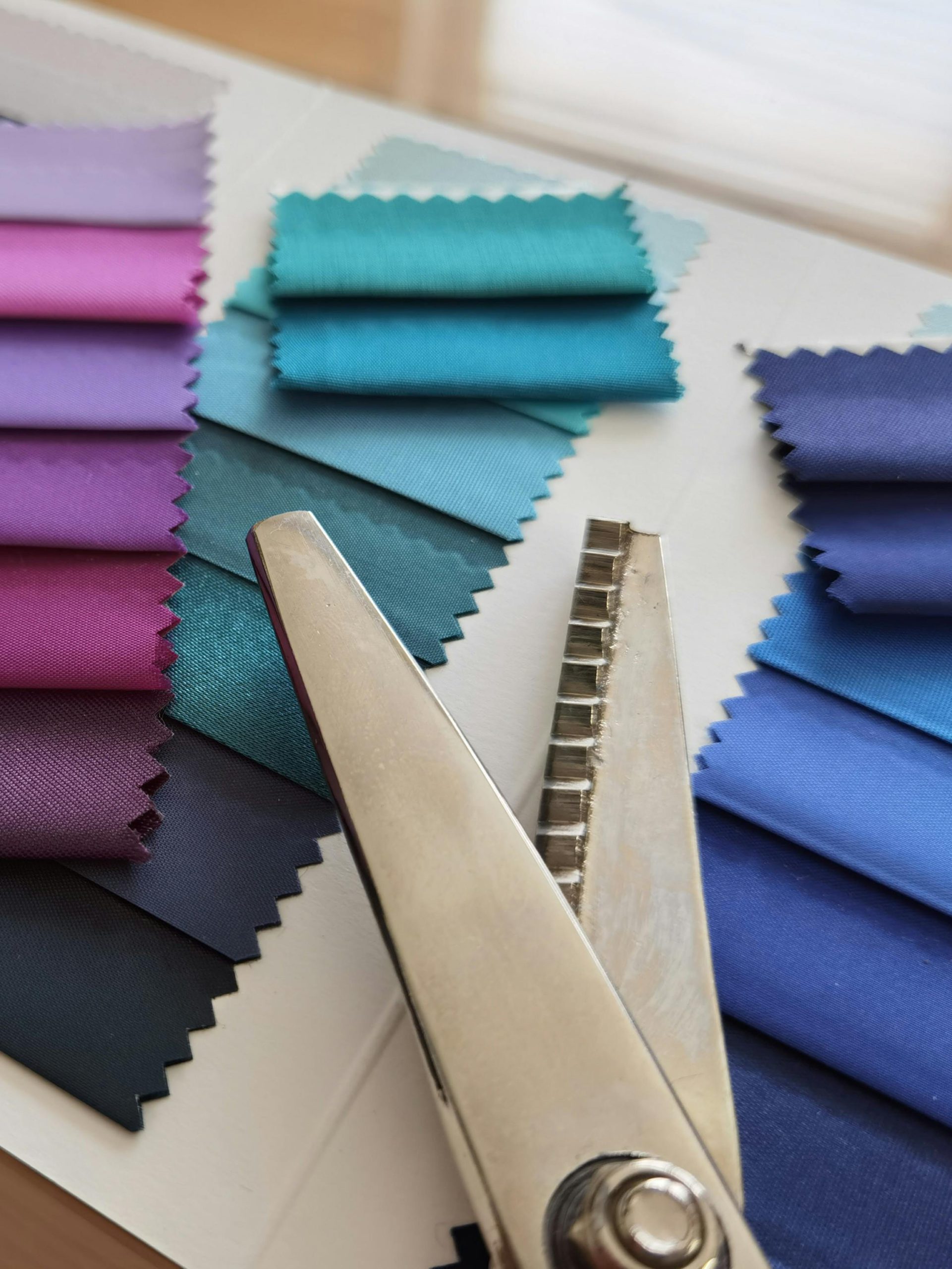
If you manufacture physical products, Pantone is essential for matching textiles, prints, packaging or custom merchandise. Simply specify the Pantone code and let your supplier handle the rest, it’s that straightforward.
Pantone sets the trends: Colour of the year & its impact
Every year, Pantone announces its Colour of the Year, and whether we realise it or not, it influences everything from fashion and interiors to packaging and digital branding. These colour selections ripple across creative industries, shaping trends and giving businesses insight into what consumers are naturally drawn to.
For creators and small business owners, keeping an eye on Pantone’s Colour of the Year can spark fresh inspiration for seasonal campaigns, product launches or visual refreshes. Aligning with these trends can make your brand feel contemporary and aligned with global design culture. You can even shop official Pantone merch to bring these shades into your everyday life, from iconic mugs and notebooks to stationery and creative essentials that add a pop of trend-driven colour to your workspace.
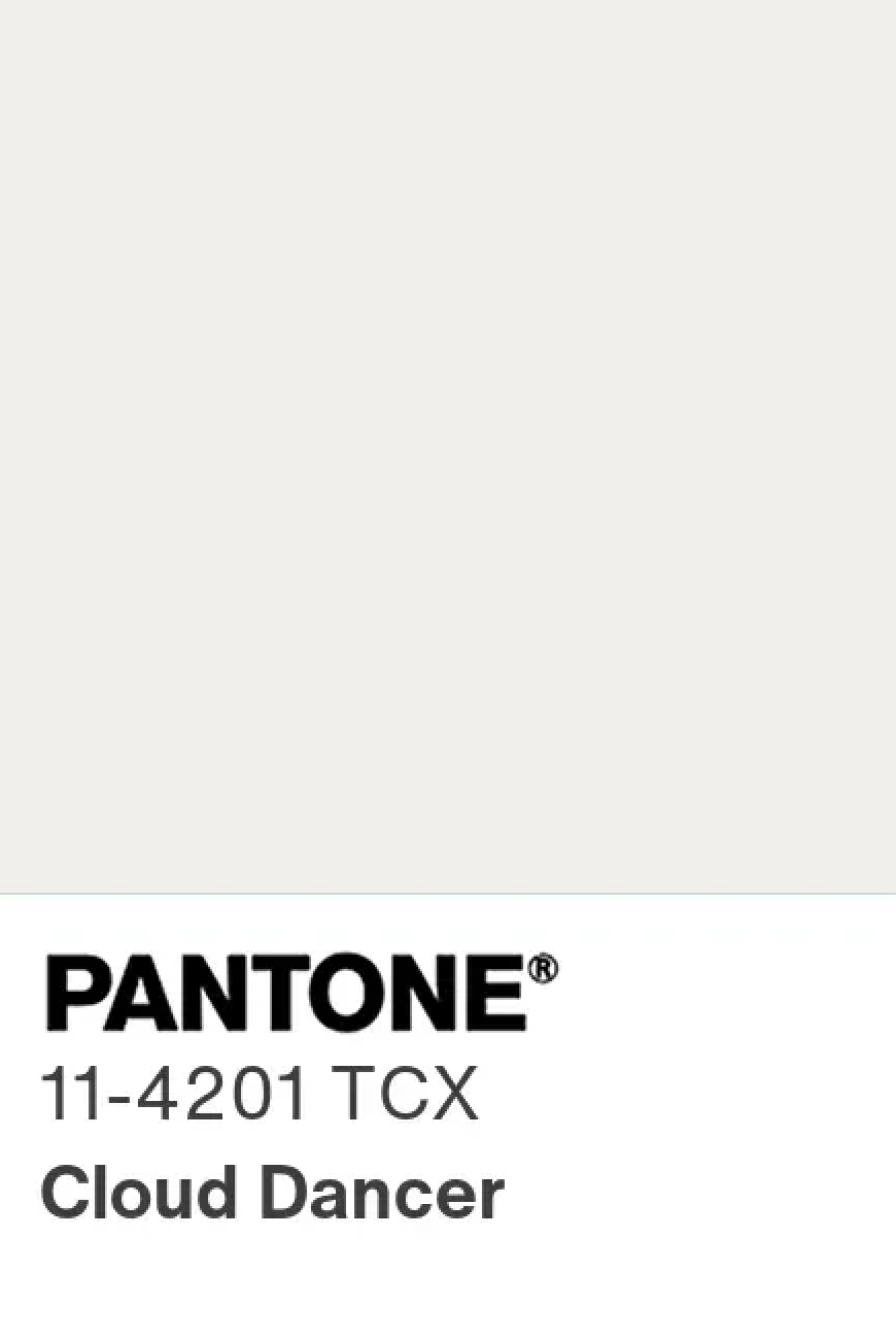
Colour of the year 2026
Cloud Dancer (PANTONE 11-4201)
The Pantone colour of the year for 2026 is Cloud Dancer, a soft, tranquil white that’s perfect for creating calm environments.
For business owners, this signals a shift toward clean, understated aesthetics across branding, interiors, packaging and product design, with consumers gravitating to serene, airy visuals. Trends for 2026 point to more neutral, versatile palettes in fashion, lifestyle and retail spaces, where Cloud Dancer’s subtlety promotes clarity and a calm space.
For Aussie small business owners and creators, Pantone offers clarity, consistency and creative inspiration. From setting global colour trends to ensuring your branding always looks on point, Pantone is a powerful tool you can use to elevate your business.
Whether you’re rebranding, launching new products or simply refining your visual identity, understanding how to use Pantone colours can make all the difference in creating a professional, cohesive and memorable brand.